Welcome back, fabric friends!
One of my favorite things about my job is being able to step into the warehouse and grab a variety of different prints to create a new group that excites me to sew something together. I'm lucky enough to step into a warehouse of fabrics, but I’m sure everyone here has their fabric warehouse of their own (haha) and you may be struggling on how to use it up together.
Being able to work here at AGF, I’ve gotten the opportunity to work with such talented people and watch a collection from start to finish has taught me many things about how fabrics should be used together. Making a collection requires a specific color palette, a variety of scales, and blenders for the perfect balance when used in a sewing project! I've applied those skills when I walk into the warehouse, and today I'm excited to share with you the first part of my series, all about matching fabrics by color! So, the next time you go into your fabric stash you know exactly how to put them together to create something beautiful.
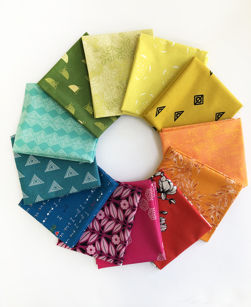
The easiest way to pair up fabrics by color is by simply understanding how the color wheel works.

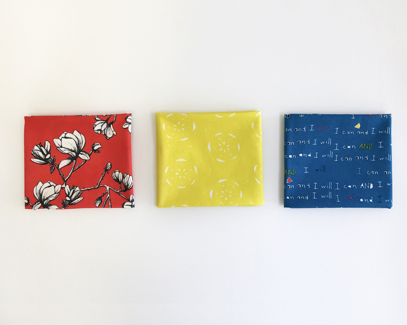
Starting with Primary Colors (red, yellow, blue) is a great way to start a project if you plan on just using one color. Maybe you want to go for a monochromatic look, you can use either color but in different shades. You can also use them together, as long as they are the same hue to avoid them clashing.
 *Featuring collection: Silkroad Fusion, Floralish, and Sisu.
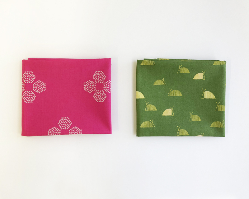
Next, we have complementary colors, which are the colors on the opposite side of the color wheel. For example, red and green, blue and orange, and purple and yellow are complementary colors. This is helpful to know because these will provide the strongest contrast. Let’s say you really want to use your favorite print in your stash, and the main color is yellow, you would want to give that print the most attention by pairing it with purple prints.
 *Featuring collections: Marrakesh Fusion and Dew & Moss
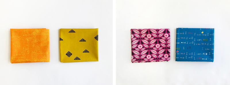
Finally, we have Analogous colors, my personal favorite way to combine fabrics together. They are the colors next to each other on the color wheel! Like blue to purple or purple to red, these are the best to create quilts with color gradients. The next time you are choosing fabrics, think about which complementary colors you like, maybe you enjoy warm colors, so you choose all the fabrics that are red, yellow and orange for your next quilt!
*Featuring collections: Matchmade, Nuncia, Spices Fusion, and Sisu.
BONUS: Here’s a helpful tip if you’re trying to create a bundle around the one print you enjoy most, look at the colors that may be a part of that print! If there is more than one color on the design, use that to guide you for the rest of the selection of your bundle. Check out the example below:
Here we have one of my favorite prints from AGF, it has these lovely floral designs but with a lot of other textures with different colors on it. From here, I will choose different fabrics that coordinate with these colors, and just to match the theme, they will be florals too.
*Featuring Trouvaille fabric collection
Here's a quick video on sewing with color that "Meli" created! Check it out for more visual examples. She featured her "Triangles" Quilt Block and AGF Elements.
That is all I have for you today, I tried my best to simplify it with the color wheel and I hope this can help you the next time you choose fabrics on your next sewing project. Please stay tuned for the next couple of weeks on the second part of my series, where I’ll be talking about matching fabrics based on the scale! Of course, if you have any questions about anything I said above, please let me know in the comments below and I will be happy to help.
Until next time,
Happy sewing!
-Jannelle


Leave a comment